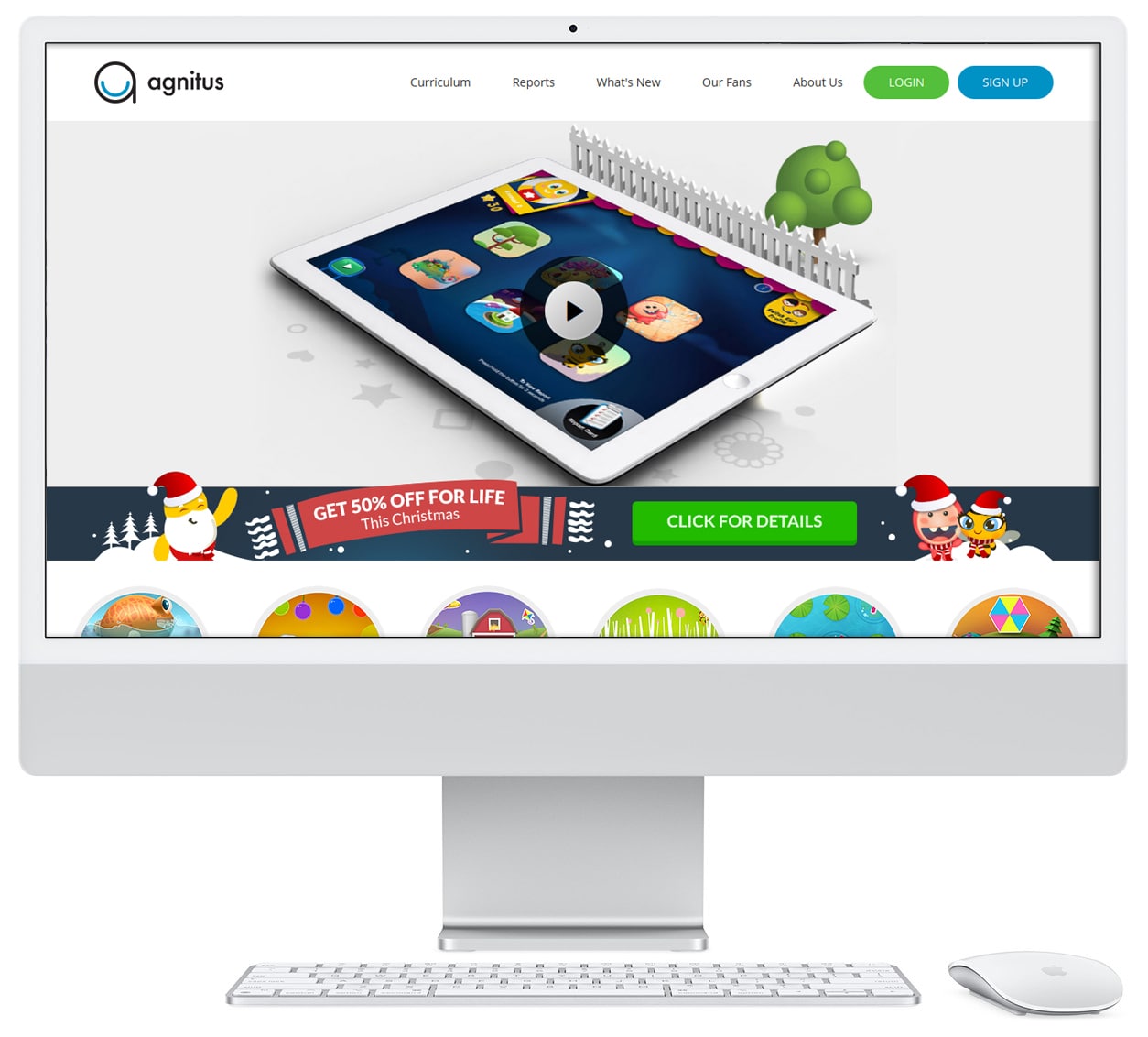
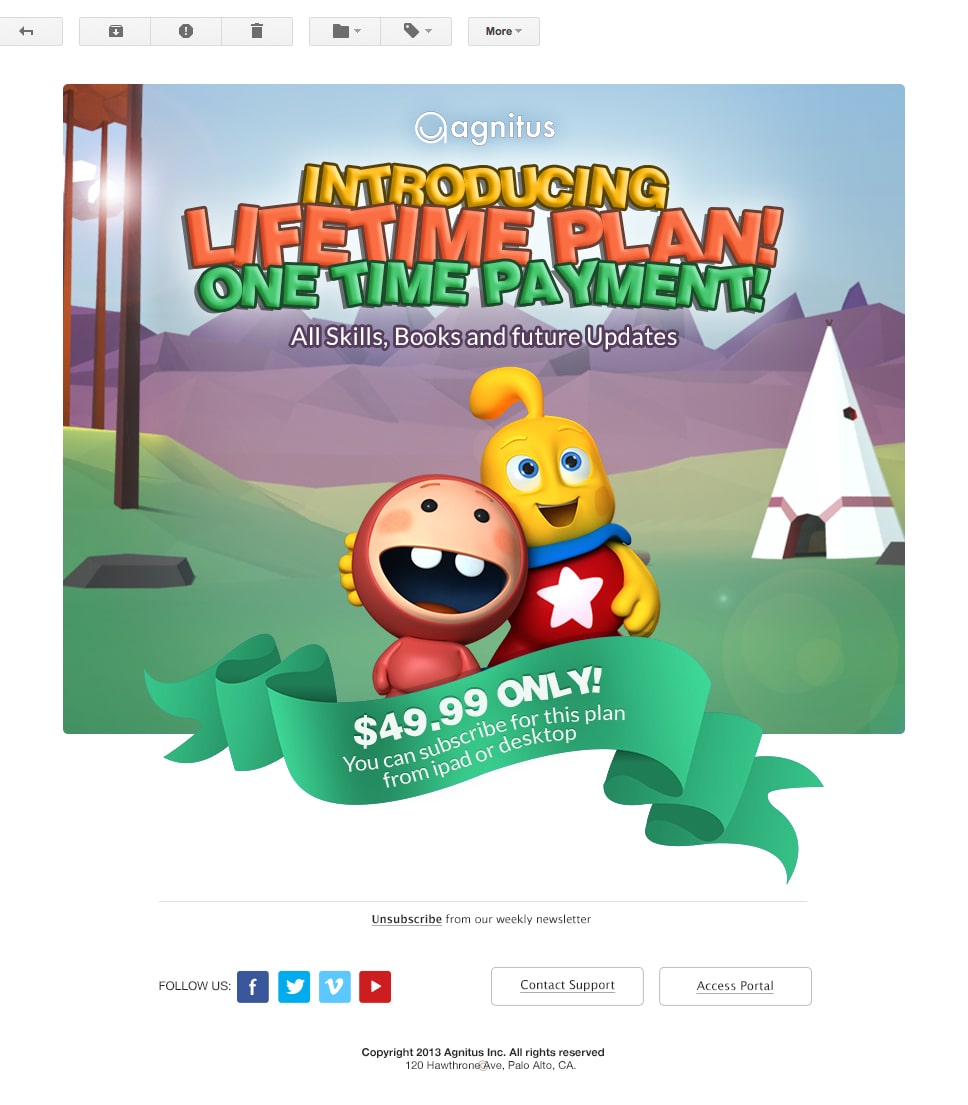
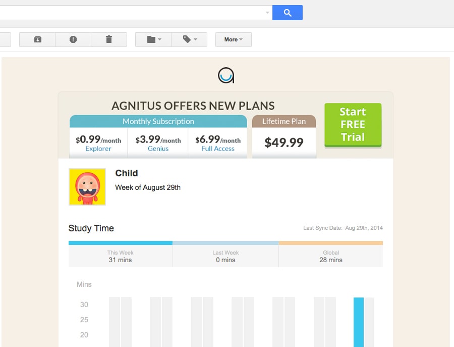
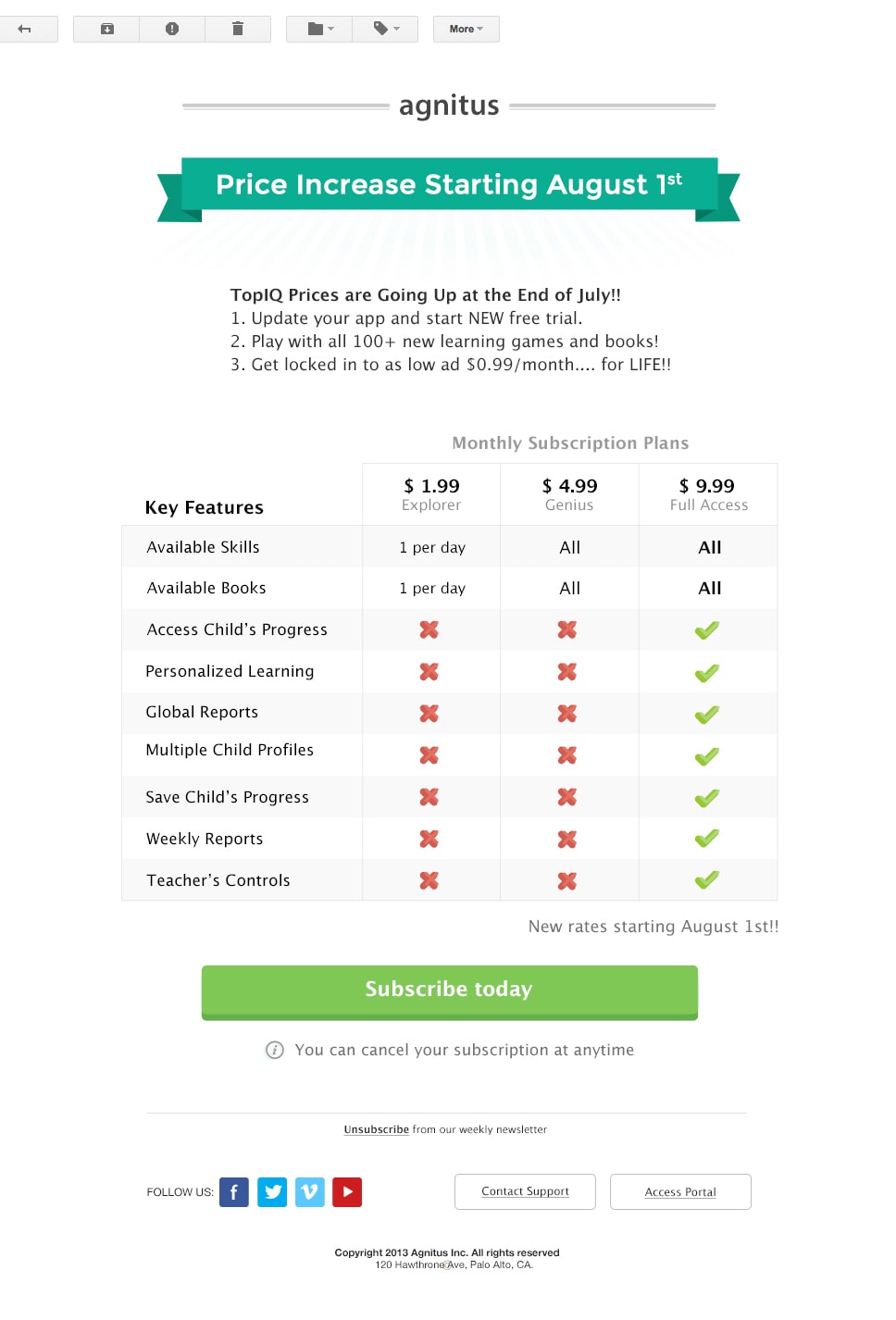
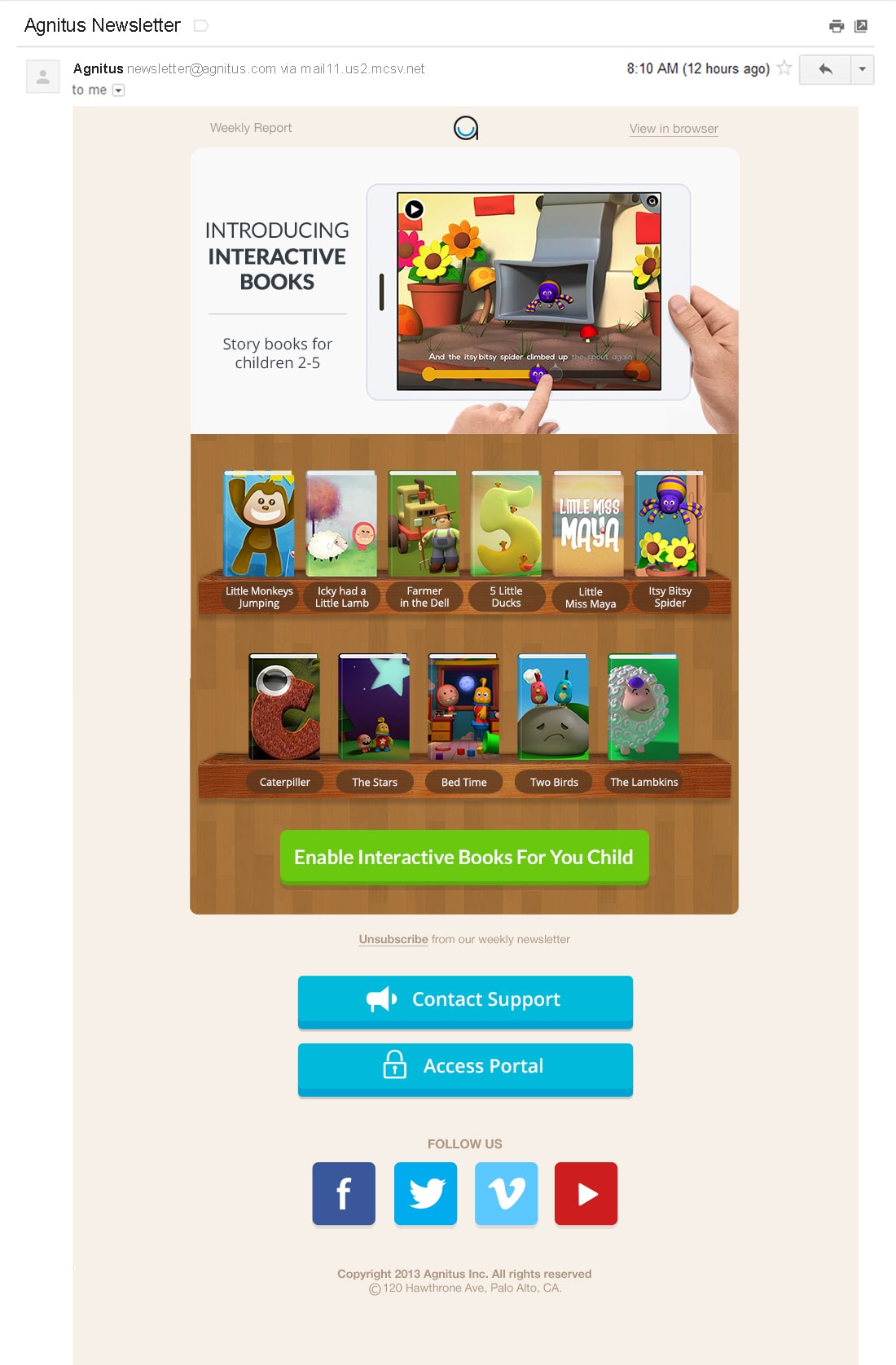
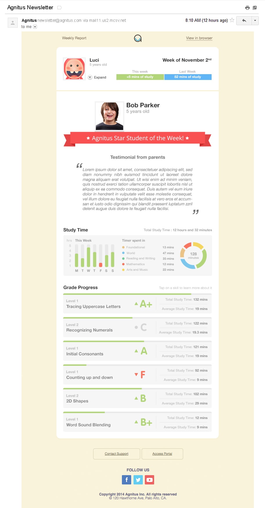
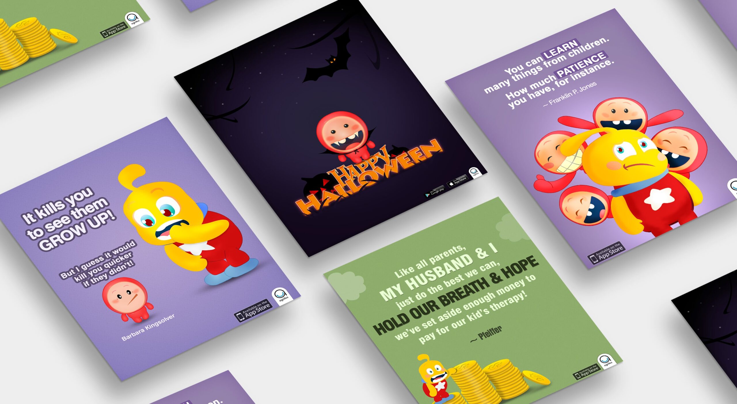
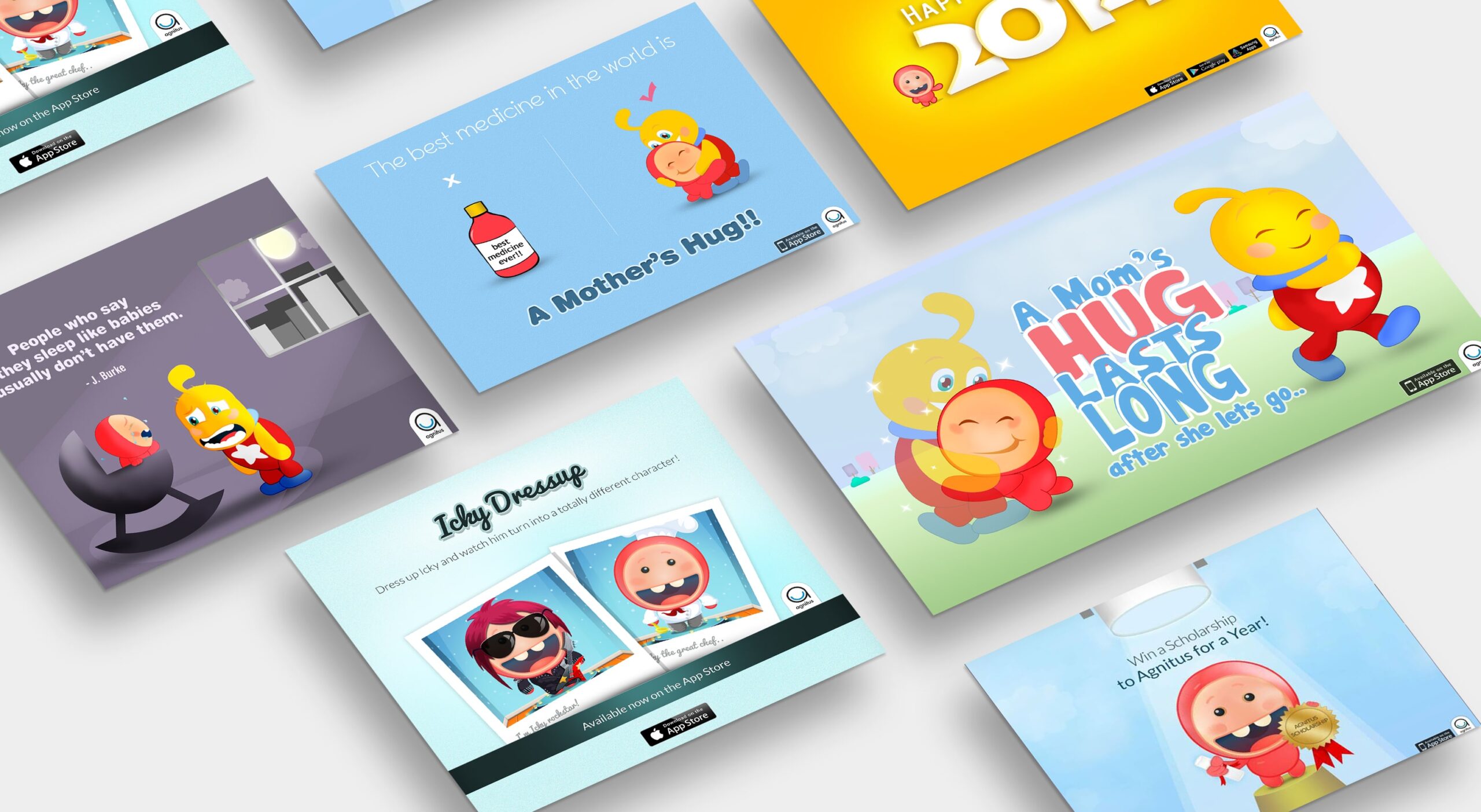
Designed marketing graphics, emails, and social media visuals
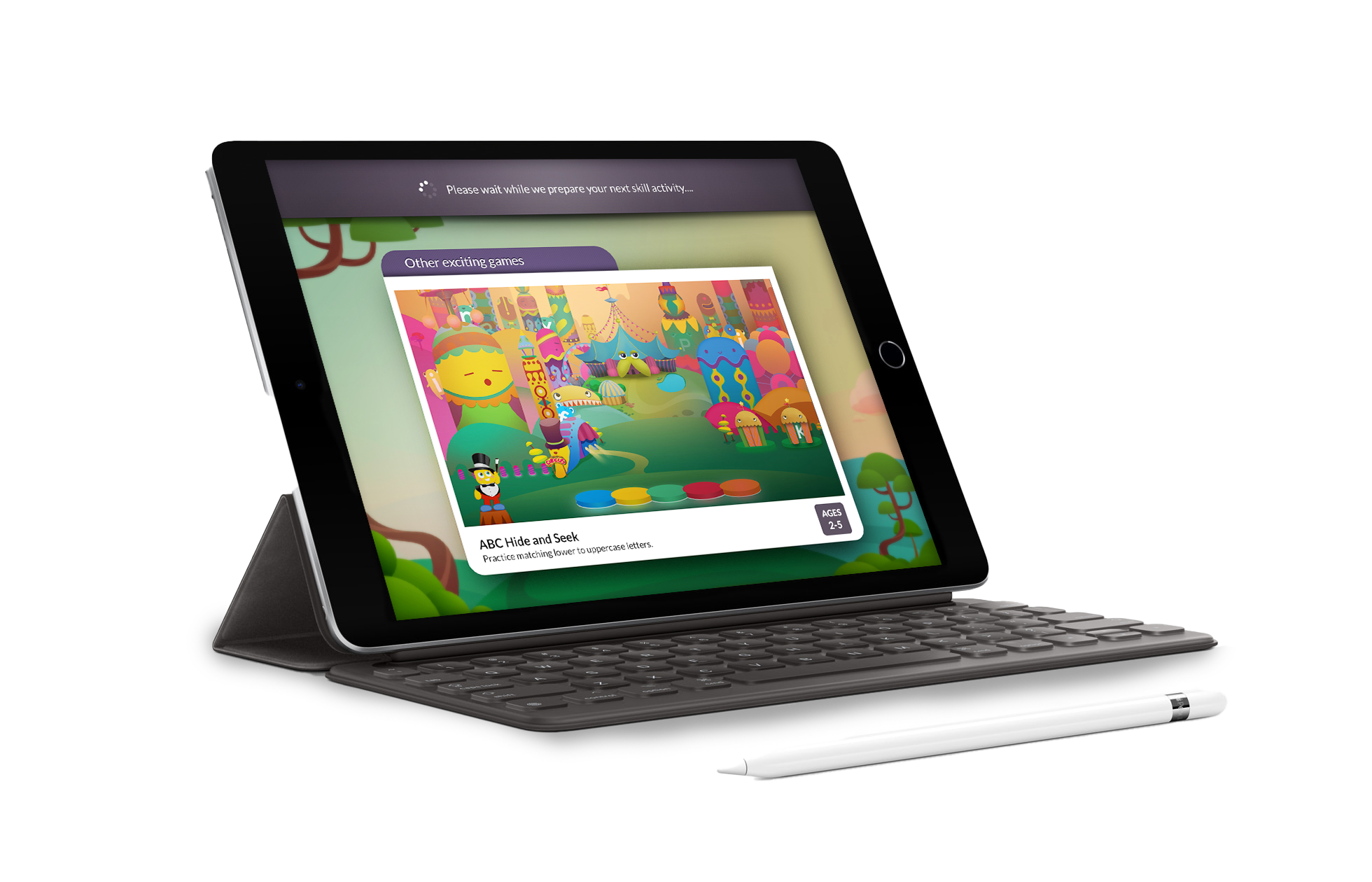
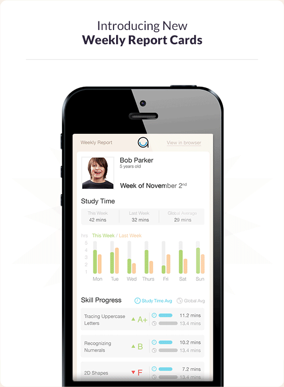
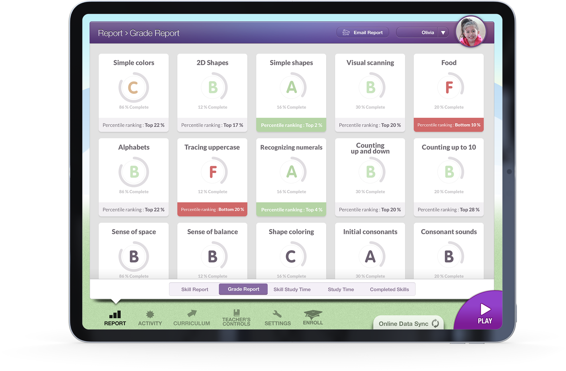
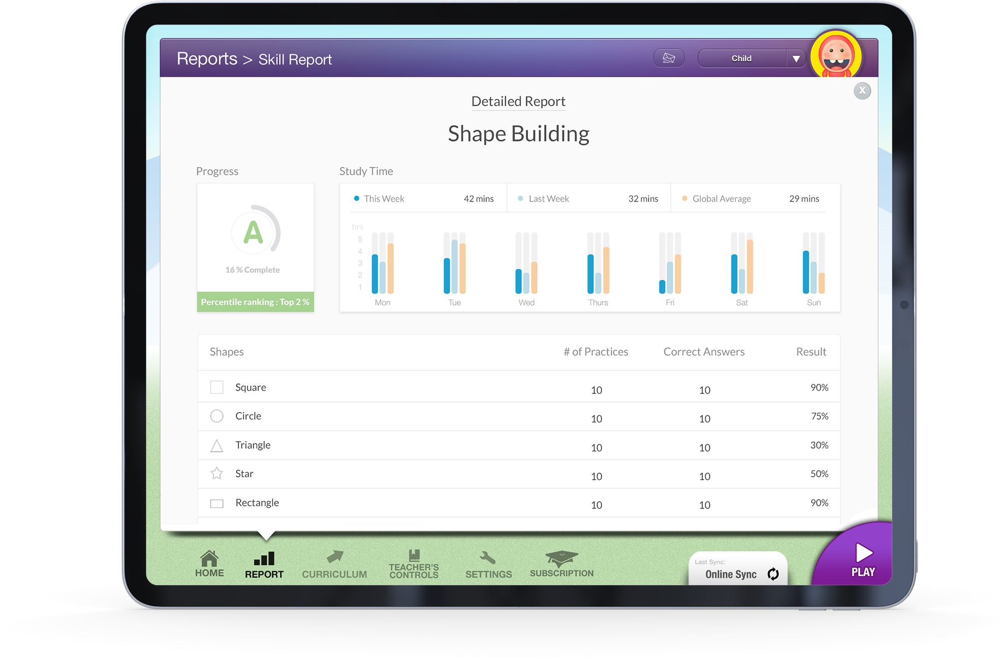
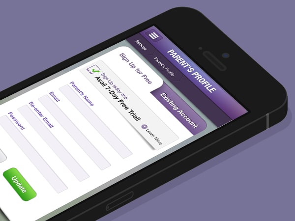
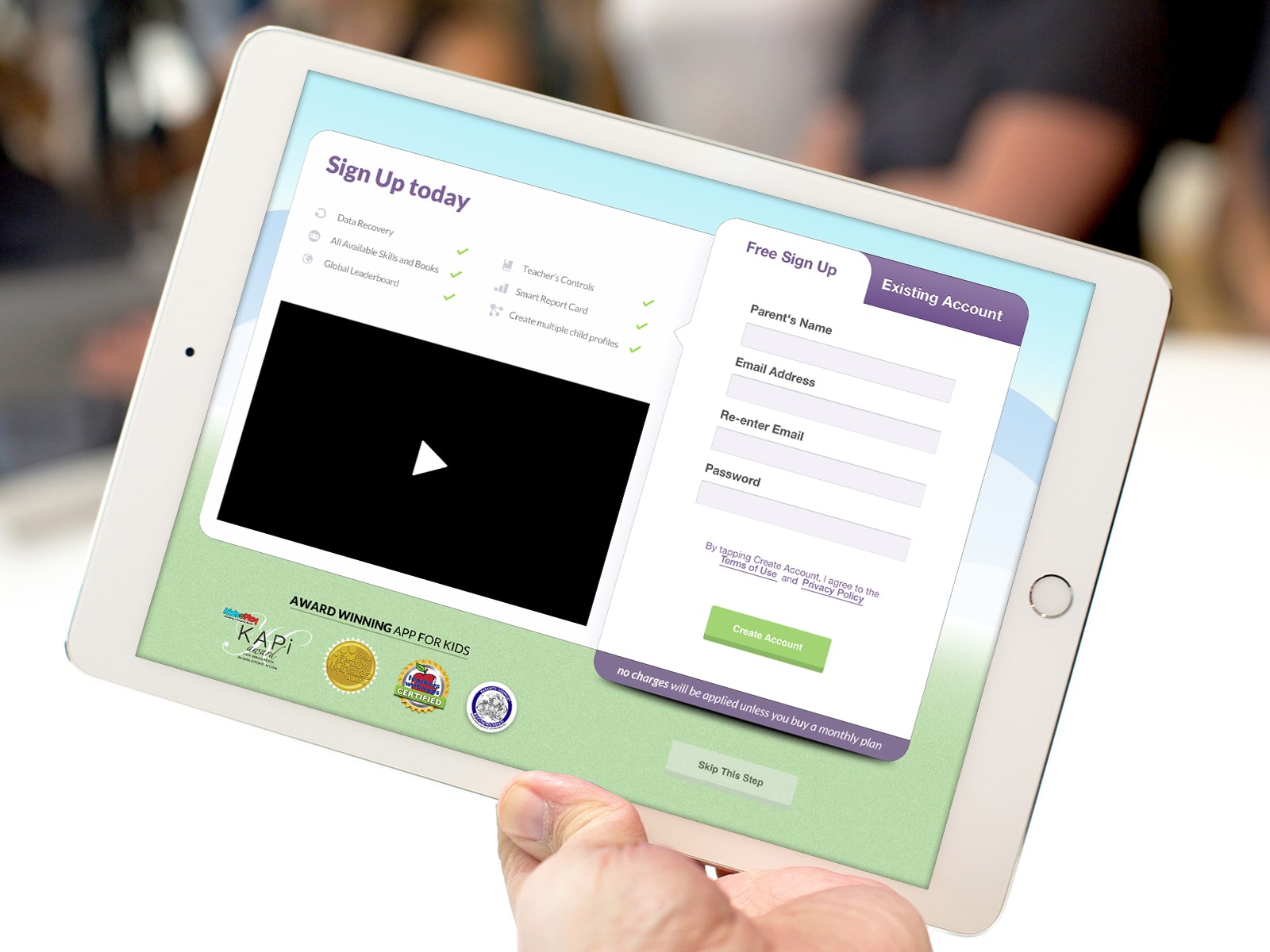
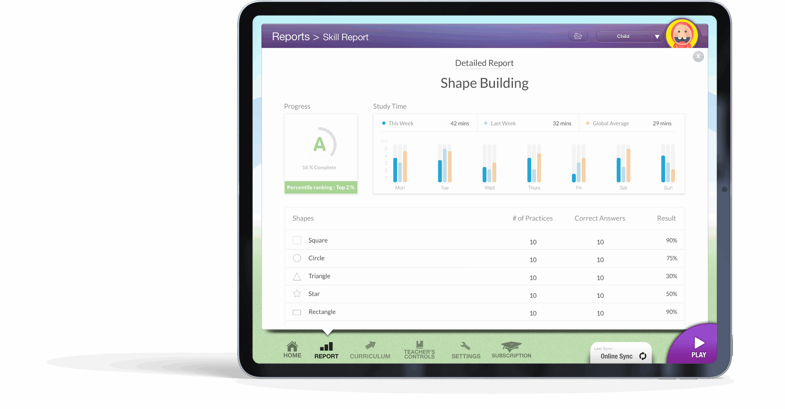
Created UI assets and iconography for the app’s learning games
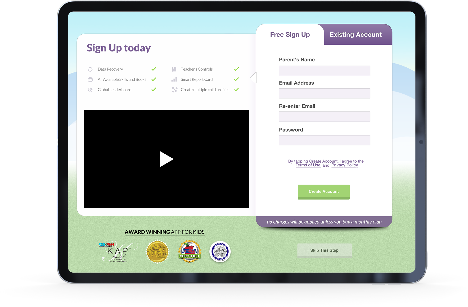
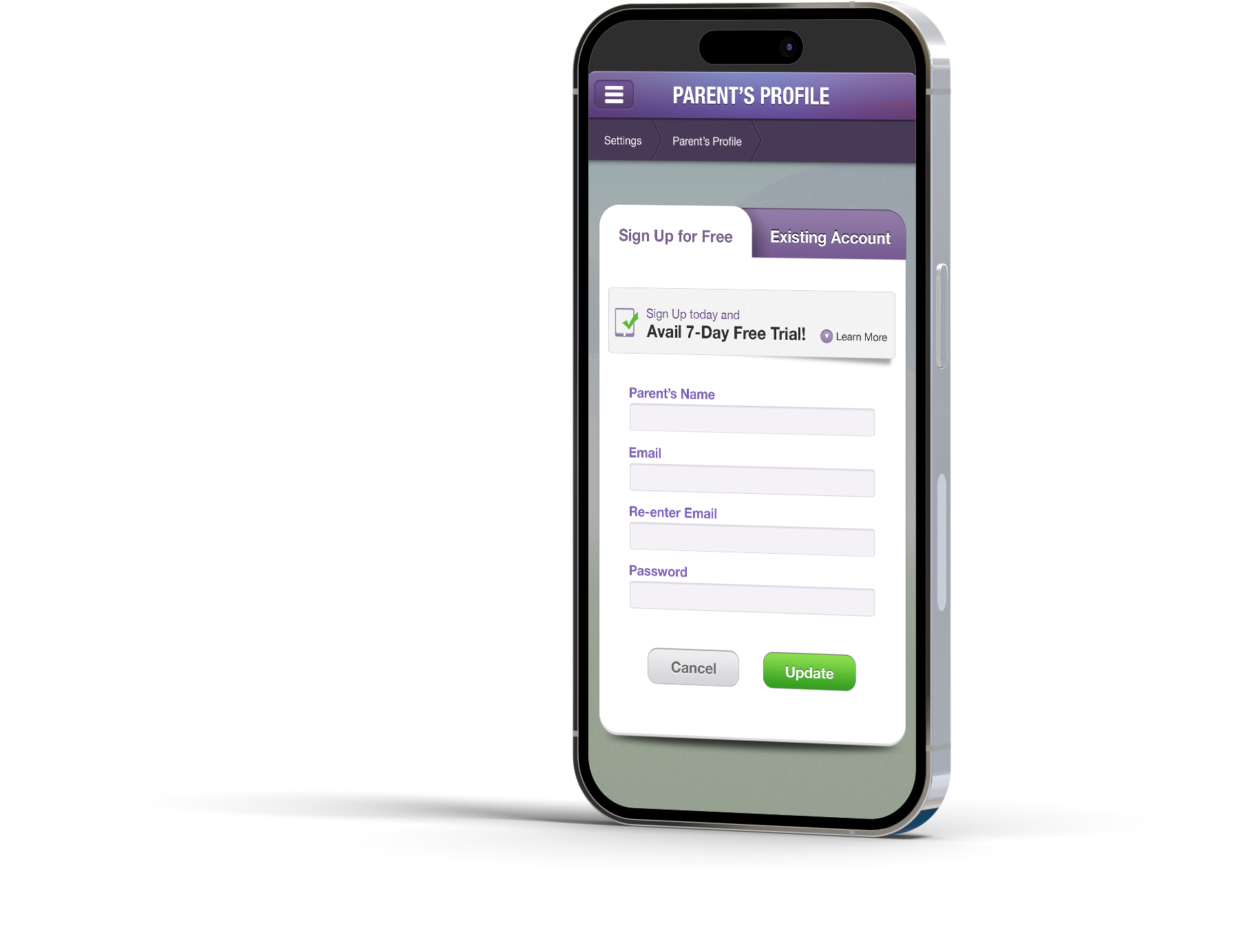
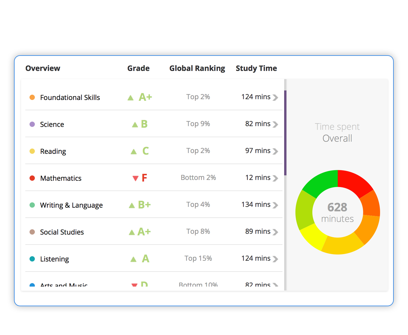
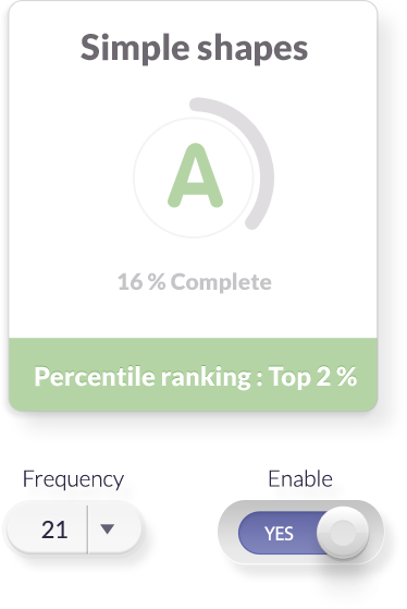
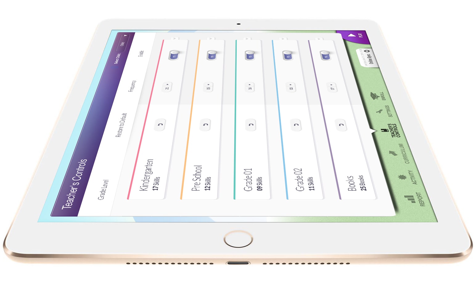
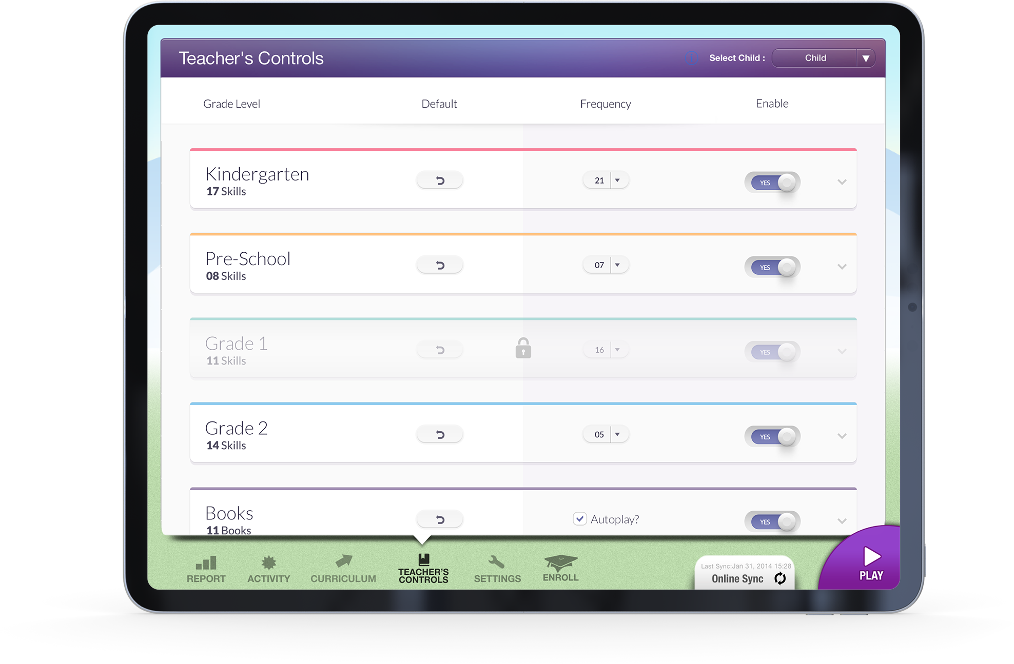
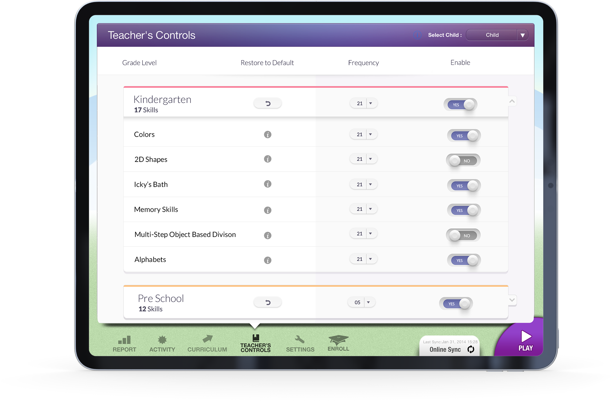
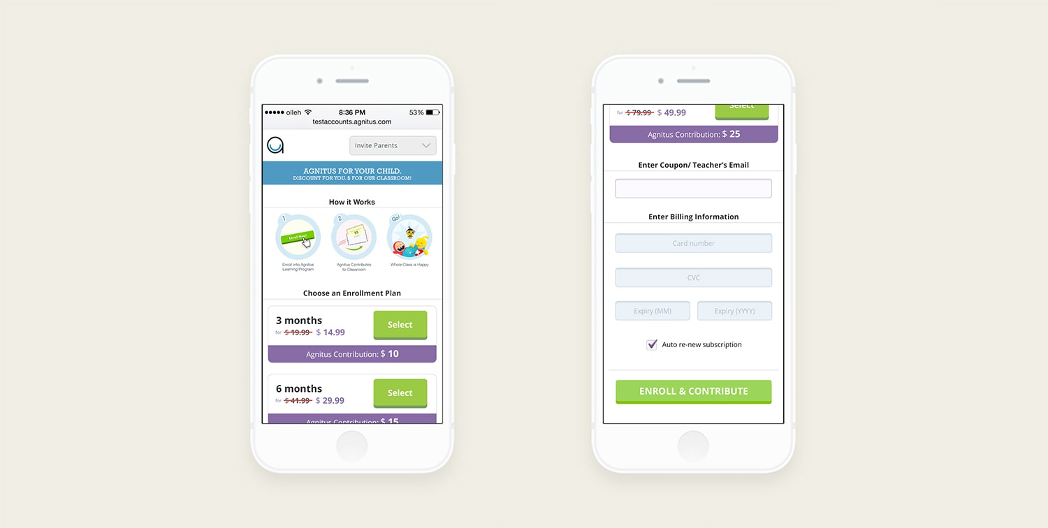
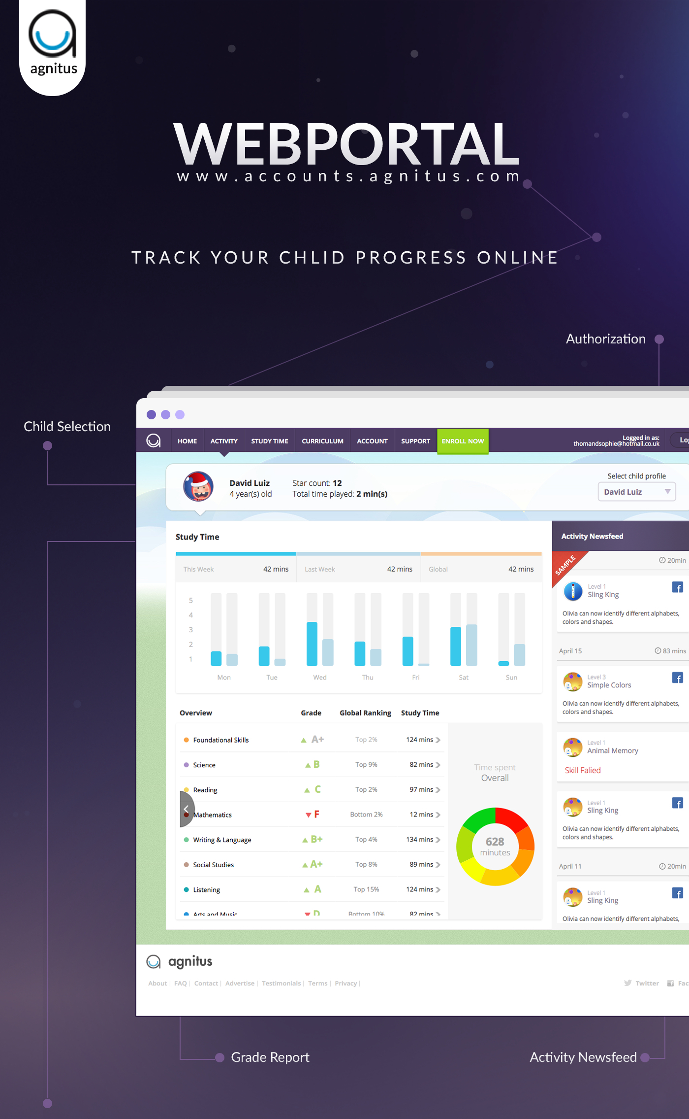
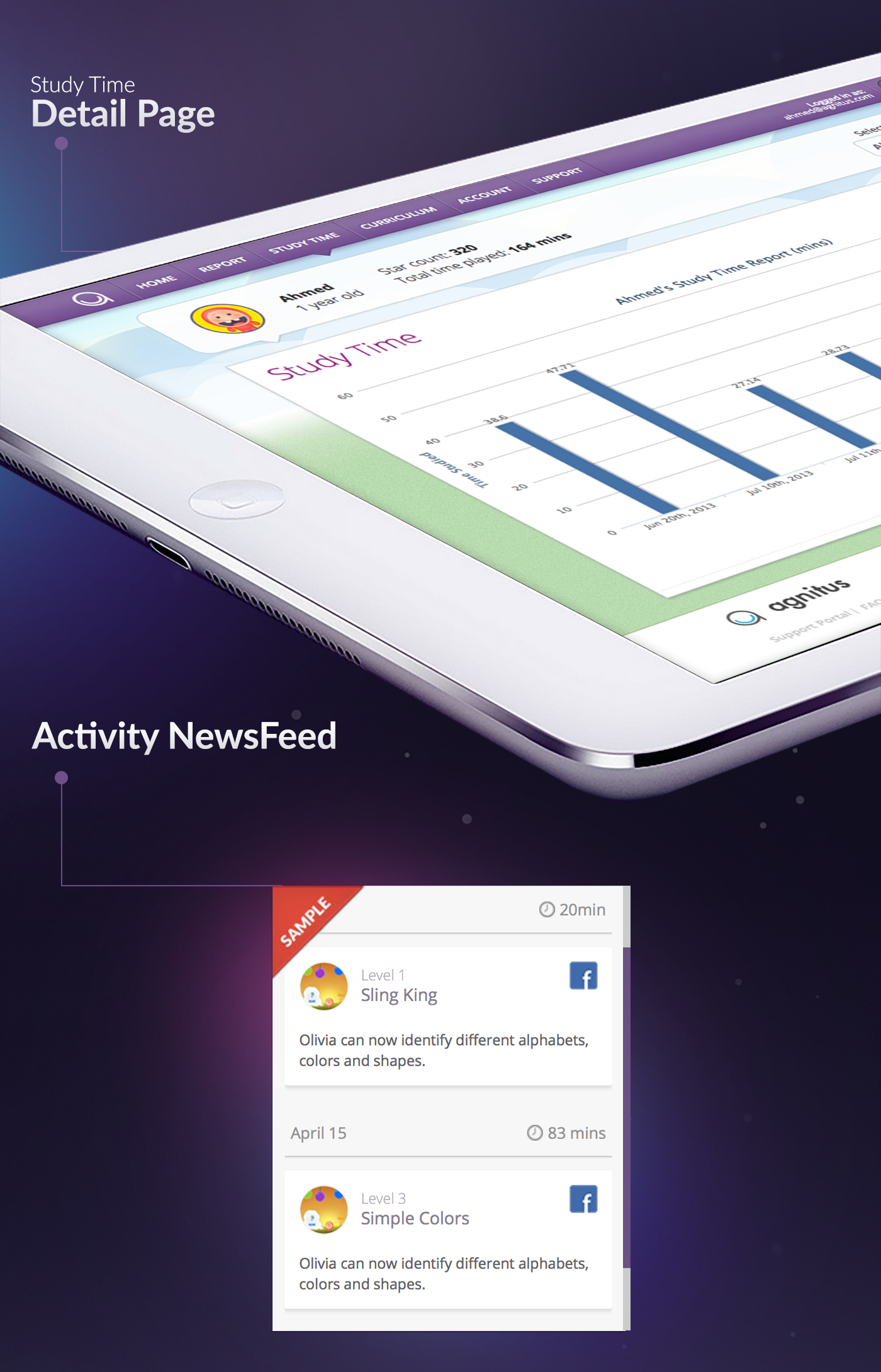
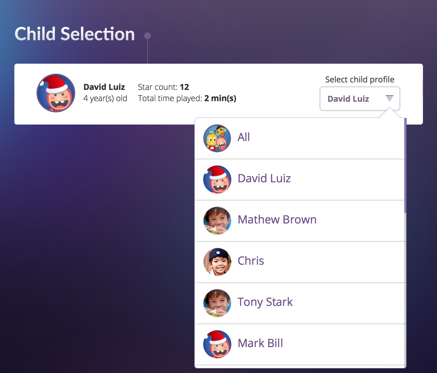
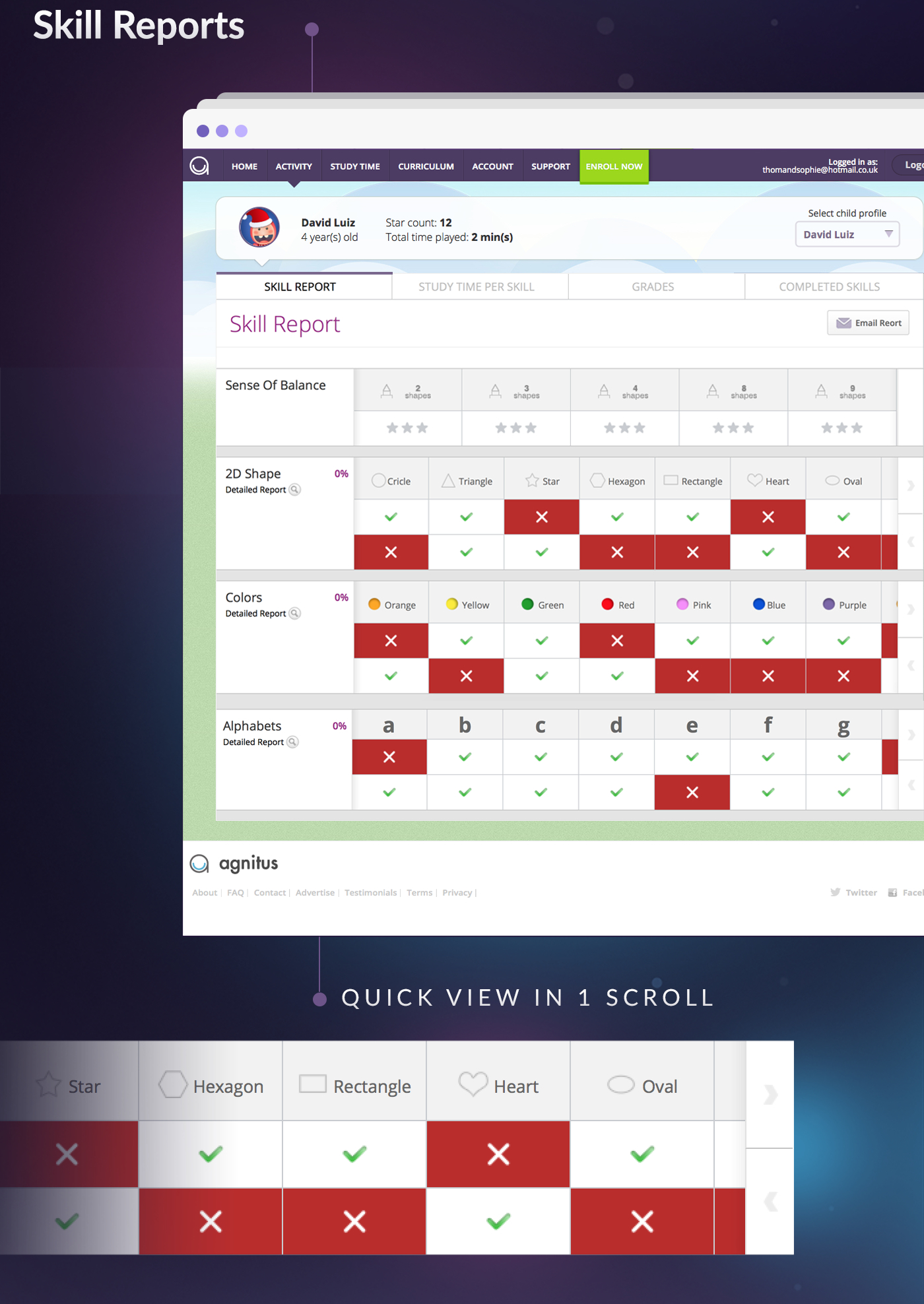
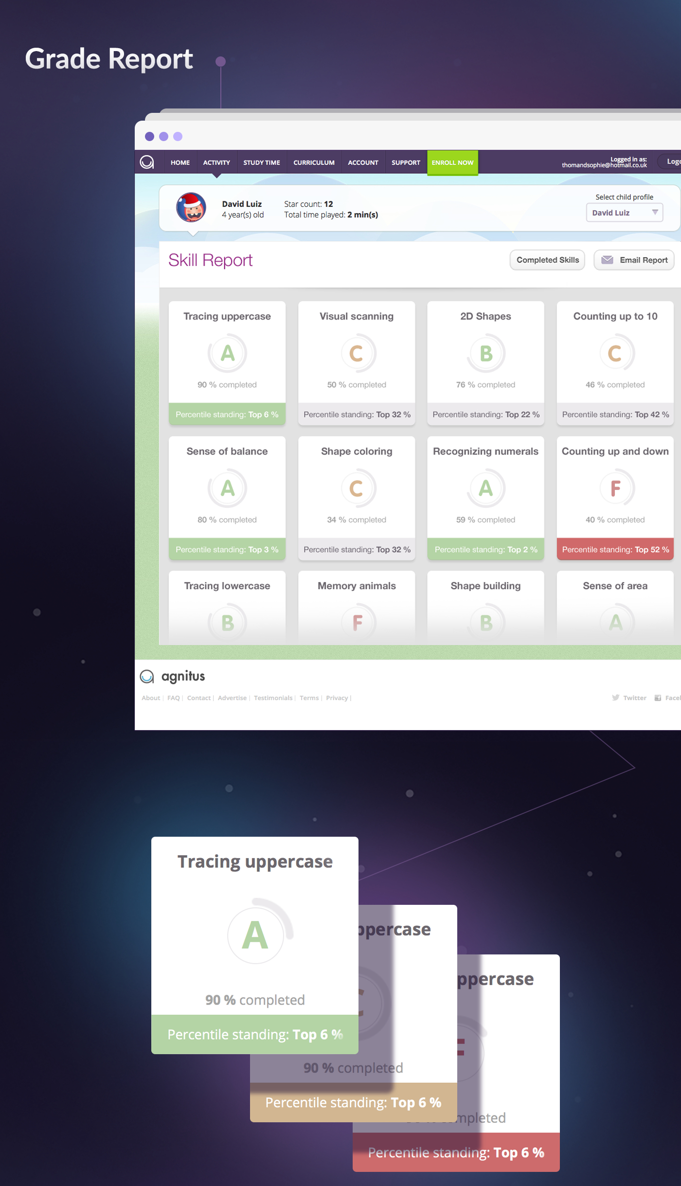
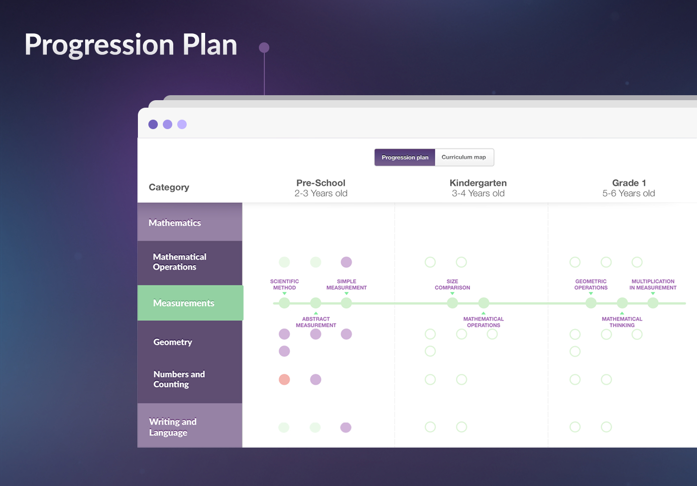
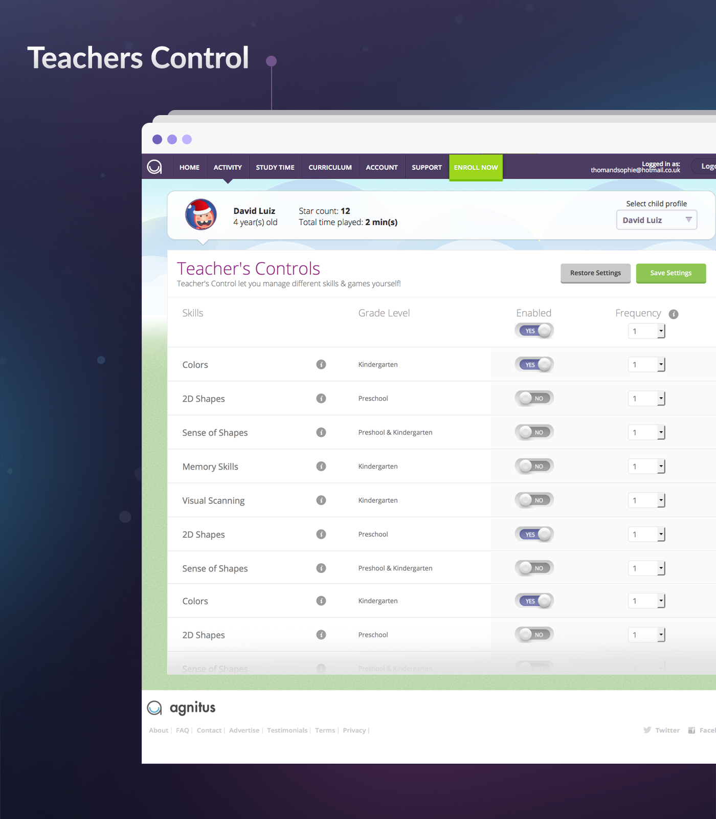
Designed and refined multiple in-app interfaces to improve usability and engagement
Collaborated with developers to ensure smooth design implementation across devices
Conducted iterative testing to validate user flows and visual hierarchy
Ensured consistent brand language across all digital and print touchpoints
Agnitus: Empowering Parents and Teachers through Insightful Learning Tools
Role: Product & Graphic Designer
Duration: 2 Years
Platform: iOS (iPad, iPhone, Desktop) & Android (Tablet, Mobile, Desktop)
Team: Designers, Developers, Product Managers, Educators
Overview
Agnitus is a learning platform for children aged 2–8 that taught early literacy, math and cognitive skills through interactive games.
Over two years, I worked across product and marketing design, creating engaging campaigns and shaping key app experiences.
This case study highlights two key UX projects that shaped the Agnitus ecosystem:
Parent Portal (Progress Report): Helping parents visualize learning progress.
Teacher’s Controls: Giving adults control over content frequency and focus.
While Agnitus effectively engaged children, parents and teachers had limited visibility into progress and limited control over activity focus.
They needed:
A clear snapshot of weekly learning progress
The ability to personalize the experience based on each child’s learning journey
Challenges
The Goal
My goal was to design tools that made learning transparent, measurable and adjustable without losing the app’s fun and friendly tone.
Discovery
I conducted interviews with key stakeholders, including the product lead, educators, employees and a small group of parents, to understand their expectations and frustrations.
Key Insights:
Parents wanted a simple report that summarized their child’s improvement over time.
Teachers needed fine-grained control to adjust lesson frequency and temporarily disable certain skills.
Both groups valued visual simplicity and progress clarity over dense data.
Define
We defined two clear UX objectives:
Awareness: Help parents easily track weekly learning progress.
Control: Enable teachers and parents to personalize learning through easy toggles and frequency settings.
Pain Points:
Parents struggled to understand their child’s learning progress due to complex data and text-heavy reports.
Teachers lacked a simple way to adjust the frequency or focus of learning activities for individual students.
Both groups wanted a clearer and interactive way to guide children’s learning without feeling overwhelmed
User Research
Parents preferred clear, visual summaries of their child’s progress.
Teachers needed more control and flexibility over learning activities.
Parents valued time-based comparisons to track real growth.
Teachers wanted the option to limit or disable overused games to encourage balanced learning.
UX Goals:
Make progress tracking visual, digestible and meaningful at a glance.
Give teachers easy control over learning activities without breaking the child’s flow.
Maintain a consistent design language that fits the Agnitus brand and can scale across future features.
Design & Solution
01. Parent Portal
Weekly Progress Report
The Parent Portal provided a simple, visual summary of the child’s weekly activity:
A bar graph comparing This Week, Last Week, and Global Average for time spent.
A skill progress section showing grading for each skill with average times.
Subtle use of color and typography to make progress trends intuitive.
Design considerations:
Simplified complex data into a story parents could instantly understand.
Used friendly colors and soft shadows to match the playful brand tone.
Prioritized time comparison and skill grading to create motivation loops.
Outcome: Parents could instantly grasp how their child was performing, where they excelled and where they needed more practice.
02. Teacher’s Controls
Managing Learning Focus
The Teacher’s Controls gave educators and parents autonomy to adjust learning content:
Collapsible grade-level sections (Kindergarten, Preschool, Grade 1, etc.) for a clean, high-level view.
Each section could expand to show individual skills and games, color-coded by subject.
Users could toggle activities ON/OFF and adjust frequency of each.
A “Restore to Default” option added confidence and control.
Design Approach:
Adopted a progressive disclosure pattern to prevent cognitive overload.
Employed color-coded skill categories to maintain quick scannability.
Maintained UI consistency with the overall Agnitus brand — warm, friendly and intuitive.
Outcome: The controls gave teachers flexibility and empowered parents to shape their child’s digital learning environment without feeling technical or complex.
Validation
Our team conducted feedback sessions with both parents and internal educators to validate usability and comprehension. The updated design improved user clarity and increased overall on-app engagement time.
Findings:
Impact
Increased engagement: Parents revisited weekly reports more frequently.
Improved learning outcomes: Teachers used the dashboard to balance play and academics.
Scalable framework: Design patterns influenced other areas, like Curriculum and Activity sections.
Reflection
This project taught me the power of visual storytelling in data design — how to turn numbers into narratives that build trust and motivation.
It also reinforced how thoughtful interaction patterns, like progressive disclosure, reduce cognitive load and empower users.


