Quick Glance
A fast, insurance-linked rental service providing replacement cars to clients after an accident, designed for simplicity and speed in moments of stress.
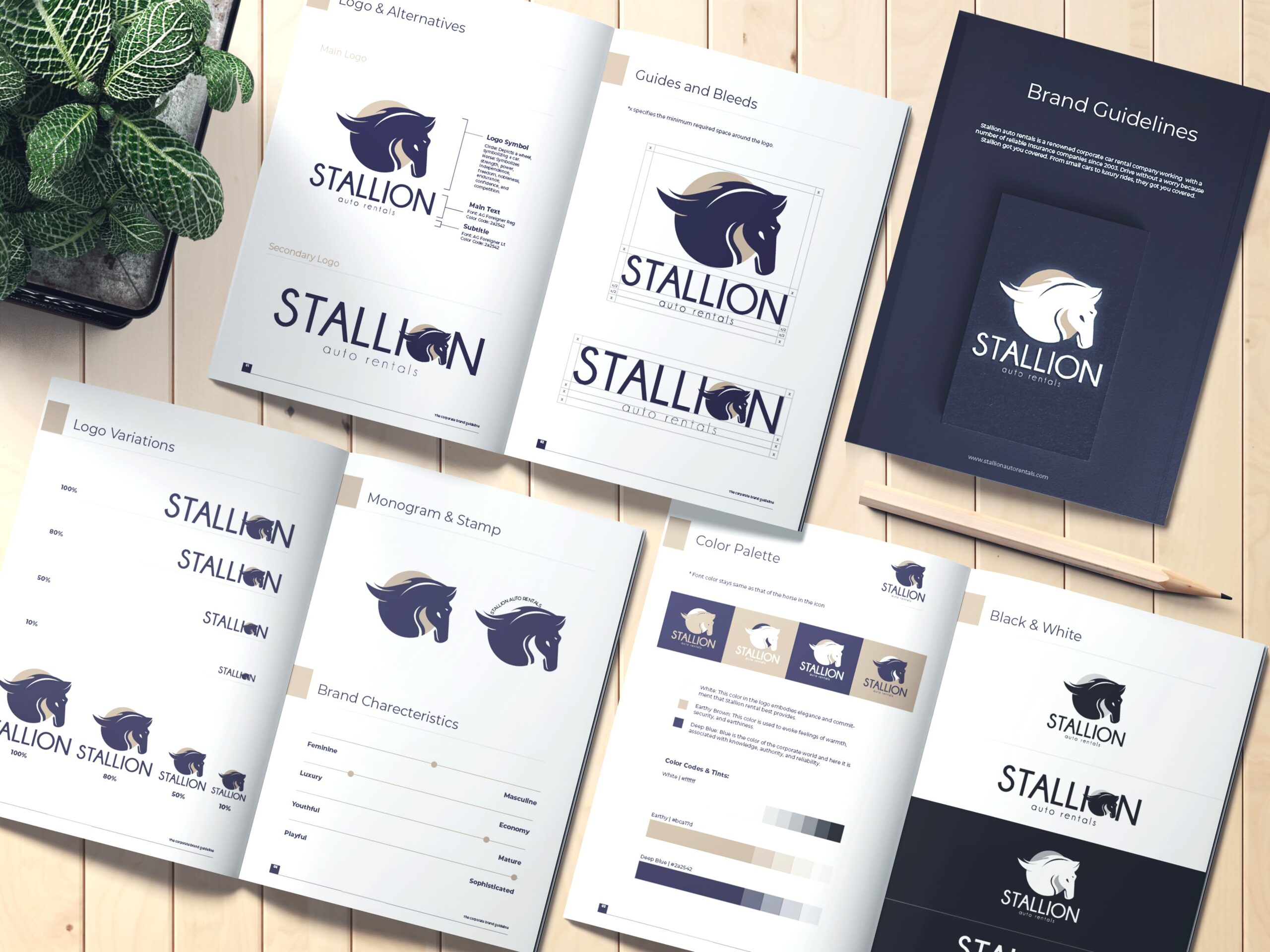
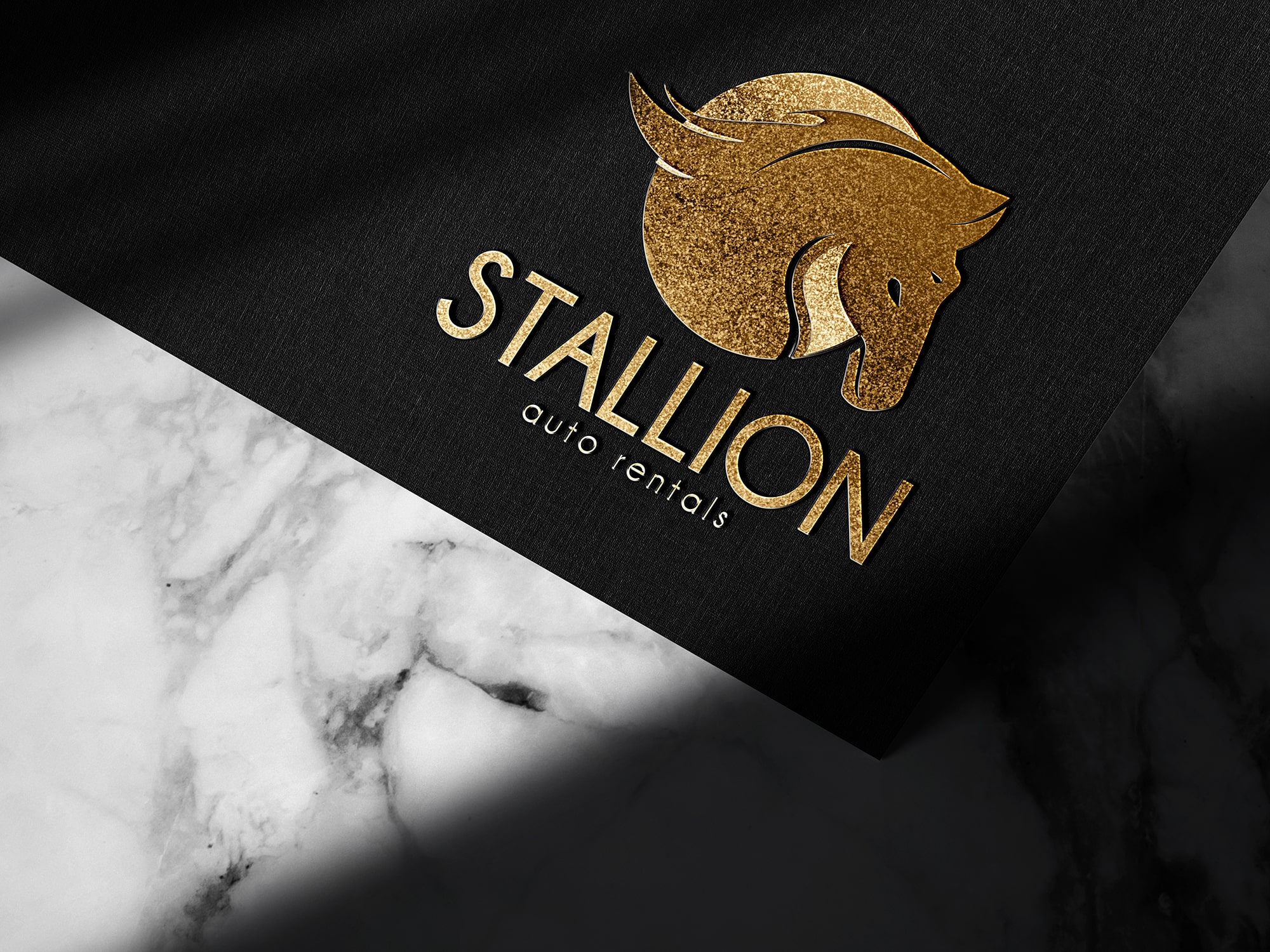
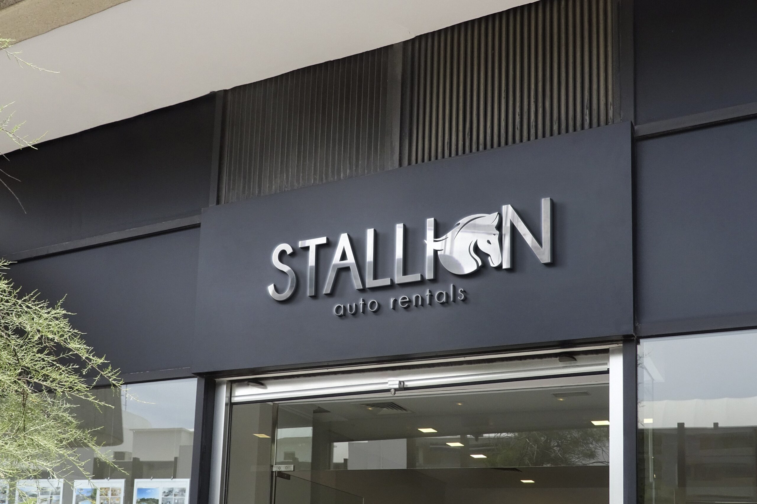
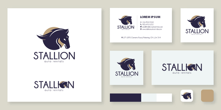
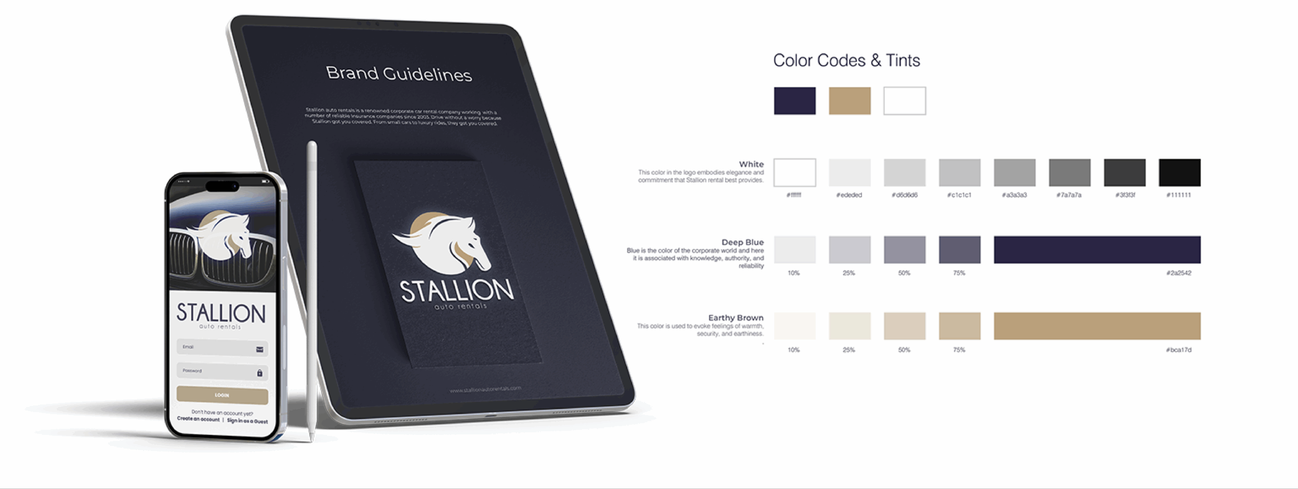
Role: Led end-to-end brand and product design for Stallion, creating a comprehensive identity system with detailed guidelines and real-world applications across print, signage and physical brand touchpoints, alongside UX/UI design, prototyping, and testing for their app.
Duration: 4 weeks
Tools: Figma, FigJam, Illustrator, Photoshop
Collaborated with: Stakeholder, Employees, Engineers, Users.
Challenge
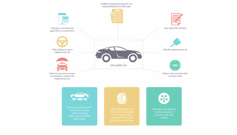
Stallion Auto Rental’s process was entirely manual. After an accident, already distressed user had to call Stallion, check available cars and then fill out lengthy paper forms before receiving a car. This meant that at a moment of emotional vulnerability, users were faced with cognitive overload, long wait times and fragmented communication.
Discovery & Research
To better understand and improve the experience, I conducted interviews with both customers and Stallion employees to capture perspectives from both sides of the process. These conversations helped uncover key friction points in communication, coordination, and documentation.
I synthesized these insights using affinity mapping, grouping recurring issues into themes such as delays in information flow, lack of real-time visibility, and inefficiencies in form handling. I then mapped these themes to the underlying user pain points to clearly define where the experience was breaking down.
Working closely with stakeholders and employees, I facilitated collaborative sessions to align on user needs, business goals, and operational constraints. Since the product needed to serve both customers (front-end) and employees (back-end), these discussions were critical in ensuring the solution would be practical and scalable.
This process led to defining a clear structure for the app, where the front-end experience focused on enabling users to check vehicle availability, receive updates, and complete required steps digitally. The goal was to streamline the journey, reduce dependency on manual coordination, and create a more seamless and transparent experience for users.
Key Insights:
- Users were emotionally overwhelmed and wanted fast car replacement with minimal steps.
- Employees struggled to handle calls and forms simultaneously, leading to errors.
- Stakeholders wanted to maintain a personal connection but reduce manual work.
- Customers wanted visual car selection rather than phone descriptions and keep checking the availability on calls.
In addition to the interviews, I performed a competitive audit of other auto rental and insurance platforms. Most focused on generic rentals, not emergency scenarios, leaving a gap for empathy-centered design. These findings framed the app’s core purpose: simplify, empathize, reassure and empower.
The Goal
To design a digital experience that reduces stress, increases efficiency and mirrors the brand’s promise of reliability and care.
Objectives:
- Simplify form completion through guided, step-by-step flows
- Allow users to visualize car options instantly and visually
- Enable digital tracking and communication for peace of mind
- Support Stallion staff with more efficient data collection The design needed to turn a stressful situation into a calm, guided experience.
Defining the Experience
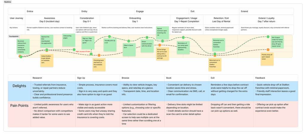
I mapped the journey from “accident to replacement”, identifying both emotional and functional pain points. Here’s the narrowed down version:
Stage
Pain Point
Opportunity
Contact Stallion
Verbal-only communication
Provide visual, guided entry via digital link
Fill forms
Long paper contracts
Break forms into smaller, digestible steps
Wait for vehicle
No updates or visibility
Add live car tracking and ETA
Return vehicle
Missed contract dates
Automated reminders and extension options
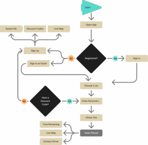
Ideation
I began sketching early concepts and information flows, working back and forth with stakeholders and engineers, aiming to create an app that felt supportive and intuitive, not transactional.
Core Concepts:
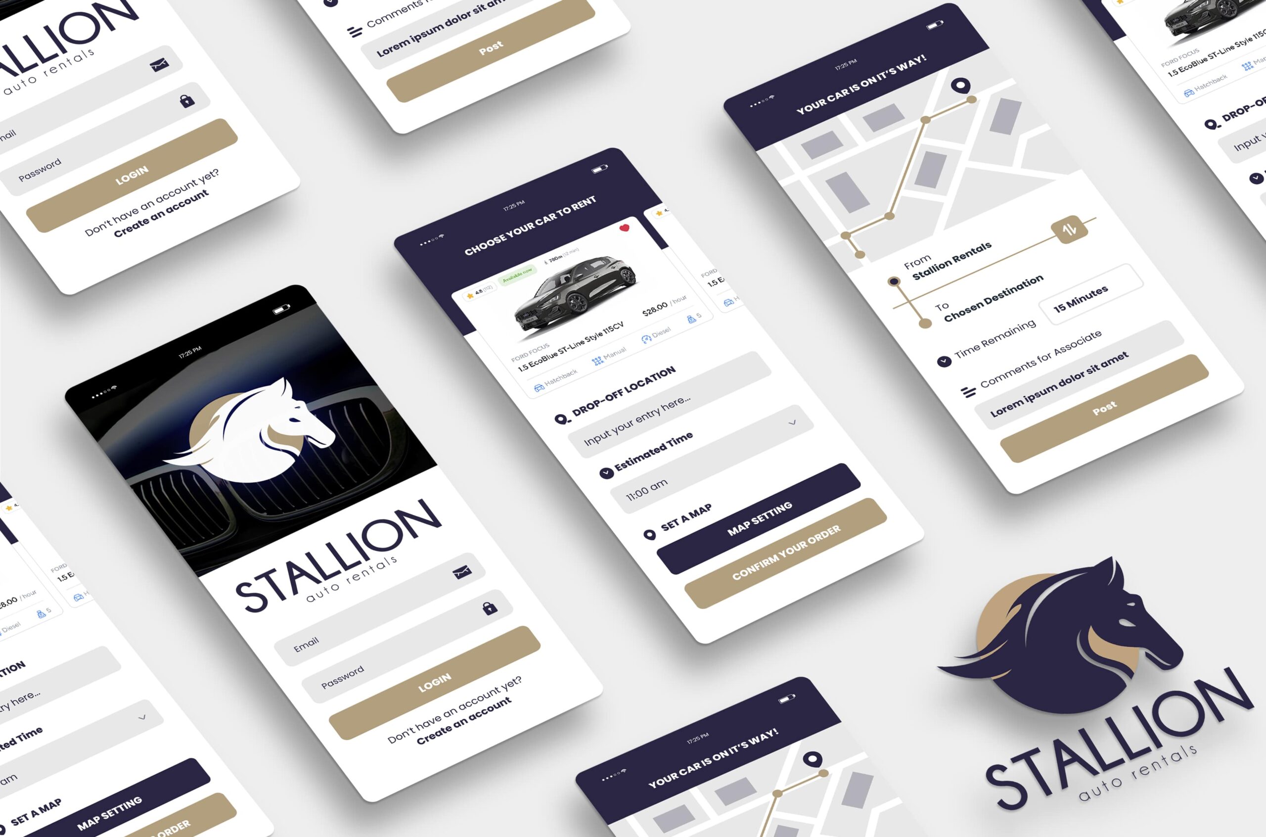
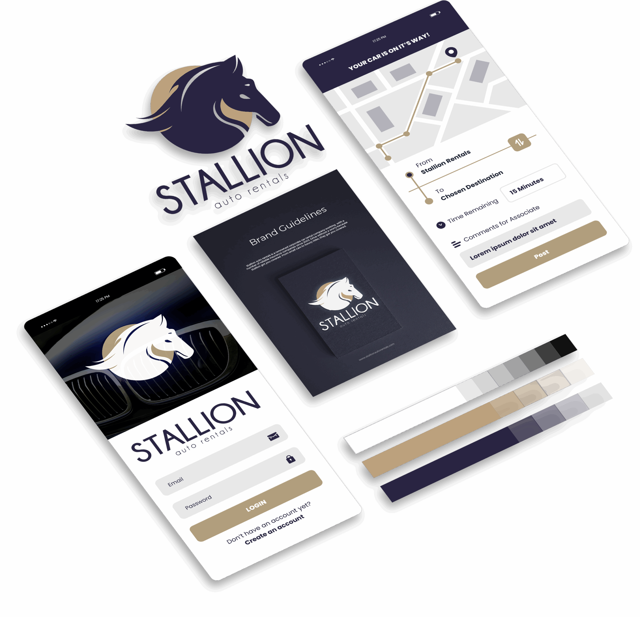
- Link-based entry: After calling Stallion, users receive a secure link via SMS to access the app instantly — no app store friction.
- Visual car carousel: Users can browse cars visually with key specs at a glance.
- Segmented forms: Information is divided into short, calming steps.
- Live map tracking: Users can see their replacement car on the way.
- In-app chat: Enables communication with Stallion’s staff in real time.
- Reminders: Automatic notifications before contract end dates.
The app was built around the principle of reducing cognitive load during high-stress moments.
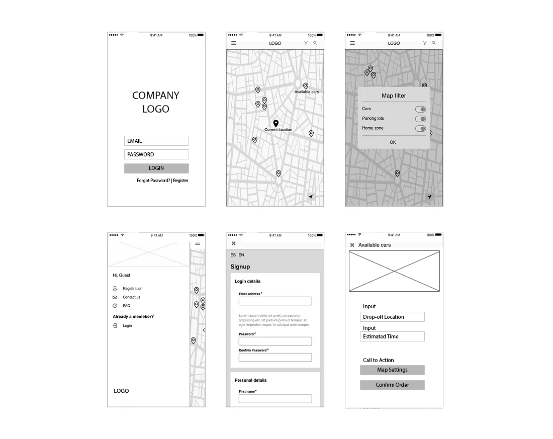
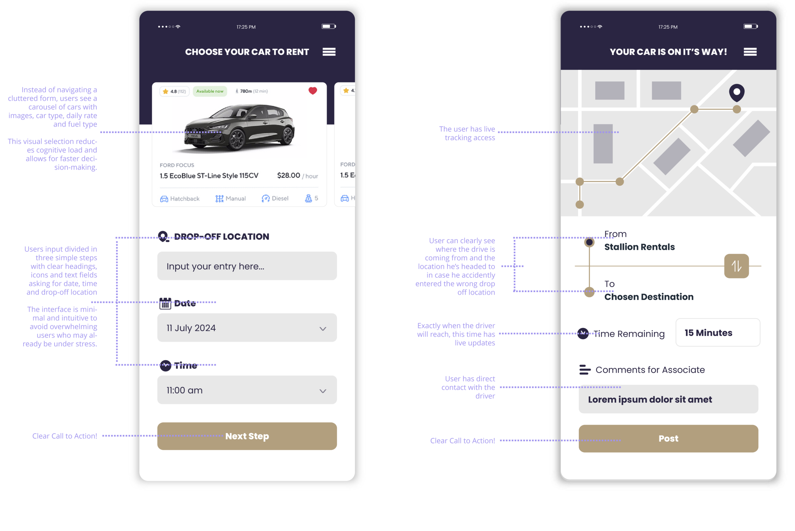
Wireframing & Prototyping
Created user flows and mid-fidelity wireframes in Figma, testing them with Stallion staff and Users for clarity and feasibility.
- Design highlights: Simple, thumb-friendly navigation with clear hierarchy.
- Progress indicator in forms for transparency.
- Calming, minimal layout emphasizing readability.
- Microinteractions to signal feedback and progress. These flows were then translated into high-fidelity prototypes to simulate the complete user experience.
UI design
The UI extended Stallion’s bold, reliable visual identity into a digital product that felt calm, confident, and trustworthy.
Visual System:
- Typography: Clean sans-serif for readability and ease.
- Color Palette: Neutral base with bold accents from Stallion’s branding.
- Iconography: Rounded, friendly icons to soften the visual tone.
- Layout: Minimal screens with generous white space to reduce overwhelm. The interface reinforced a sense of control and guidance, especially in moments when users felt helpless.


Validation & Feedback
Conducted validation interviews and usability testing with
- Stallion’s stakeholder to confirm business alignment
- Employees to ensure operational efficiency
- Users to assess usability and emotional response.
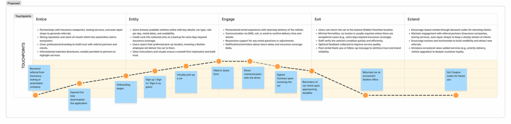
Following images show the ideal and real user journey mapping. Real user journey has both mappings from their manual process and new suggested process for comparison.
Users reported that the app felt “easy,” “trustworthy,” and “relieving.”
Impact
Reduced stress for post-accident users through simple, visual, guided steps from the comfort of their homes.
Reduced Cognitive Load by selecting from available cars from car image carousel with a quick overview at a glance.
Eliminated paper forms by digitalizing the contract process, divided into simple steps.
Improved communication between users and Stallion’s staff.
Enhanced operational efficiency through automation and structured data.
The Stallion app successfully bridged empathy and efficiency — helping users feel cared for while keeping the process effortless.
Reflection
This project reminded me that design is most powerful when it shows up at someone’s lowest moment and makes things just a little easier.
Designing the Stallion app wasn’t about adding more screens, it was about removing obstacles, creating clarity, and restoring calm.
It’s a project I’m proud of, not just for how it looks, but for how it makes people feel.